On Indiegogo's Design Update
24 Apr 2014Indiegogo recently updated the design of their webpage. As with any change, people have opinions and I’ve got some myself.

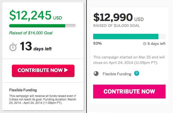
The old (left) and new (right) design of the contribute panel.
Full disclosure: I am not a designer, and do not purport myself to be one. But I do have feelings about this design that may or may not be grounded in sound design principles. To be safe, just consider me a guy with an opinion (dangerous) and enough time to put said opinions on the Internet (extremely dangerous).

Flexible funding and funding duration separated in the new design.
- Like - In the new design, they hid the explanation of what Flexible Funding is behind a question mark. In the old design, the explanation for flexible funding was awkward, because it was an explanation of what flexible funding is, followed by the funding duration which is independent of flexible funding. The new design floats the funding duration explanation up and separates the two (i.e. what the funding duration is and what flexible funding is).

Thin and blending into the background is in style.
- Dislike - The text color. Holy crap this is so annoying because it makes no sense to me and everyone seems to be doing it these days. Why are people making fonts thinner and more similar in color to the background!? Who thought having a thin, light grey font on a white background is a good idea? Do you want to make it hard for me to read the text? BECAUSE IT DOES. If it’s information that’s less important and you don’t want to call attention to it, just get rid of it. Don’t freaking camouflage it.

The new design brings all the text together.
- Like - In the old design, the elements explaining how far along something was funded was: text amount of money raised, bar indicating percentage raised, and text of the total amount desired. It seems a bit disjointed because you would read it as “x dollars raised,” then here’s a pretty picture that indicates some percentage towards completion, followed by “out of y dollars.” The new design floats all the text up, and puts the graph at the bottom. From top to bottom it now reads as “x dollars raised out of y,” (red box) followed by a picture to show you this information (blue box).

These days, all the COOL buttons are FLAT.
- Indifferent - The new, FLATTER contribute button. Flat design is all the rage these days, but I’m going to go out on a limb and say it: “I don’t see what the big freaking deal about flat everything is.”
So there we have it. Frightened readers (or lovers of flat buttons and hard-to-read text) should be comforted by the fact that I’m only a software developer and not a designer!