The Many Faces of LinkedIn Premium
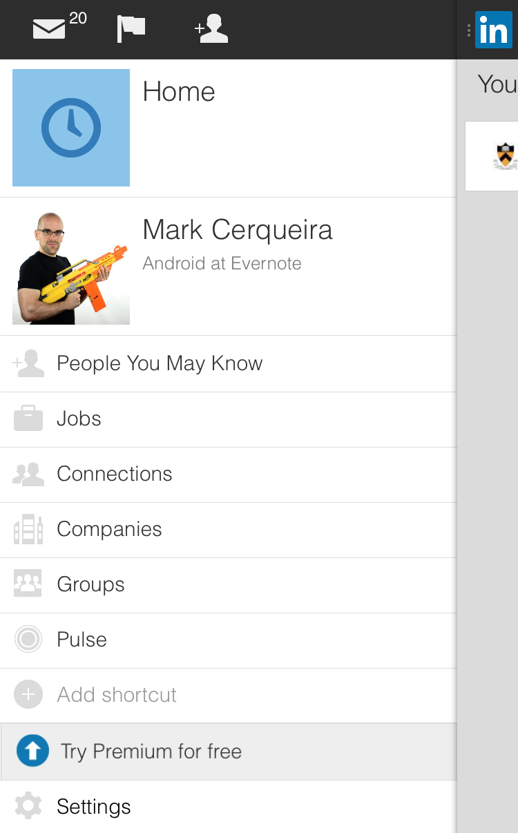
20 Mar 2015I was browsing LinkedIn the other day on my iPhone. I opened up the navigation menu and I clicked on Try Premium for free because for some weird reason I was drawn to it. Totally unrelated observation: it’s the only menu item with a colored icon. In we go!

Something drew me in...
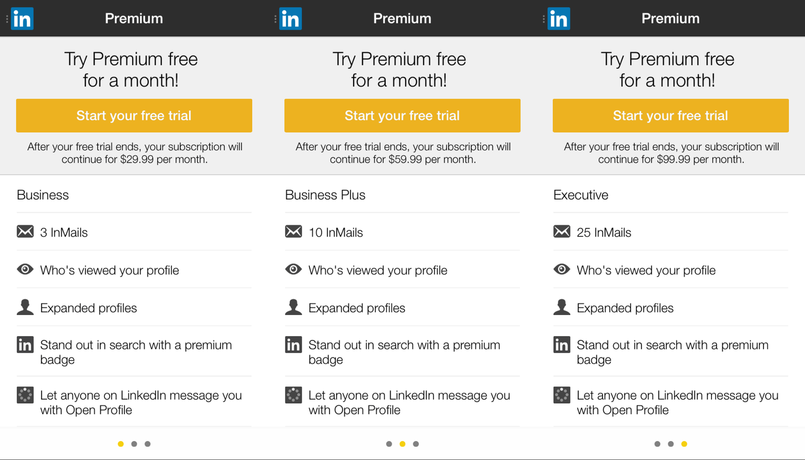
And this is what we find. There are three different pages to look at. Here is a GIF animating through them. Take a look!

-
There are three tiers: Business at $29.99 per month, Business Plus at $59.99 per month, and Executive at $99.99 per month.
-
There isn’t much difference between the three different tiers. Price (obviously) and tier name (seemingly meaningless because I don’t see this used anywhere else on the site) aside, the only difference is the amount of InMails you are allotted. When first swiping through these pages, I thought something was wrong because the feature lists are nearly identical.
-
The icon for the messaging through Open Profile feature looks like a loading spinner that is stuck. Ugh!
-
While we’re nitpicking, for features that have text spanning two lines, the icon and text do not line up nicely. Double ugh!
-
Wow – InMails cost a lot of money. Are you telling me these unsolicited messages on LinkedIn cost people (Hey – recruiters are people too!) between $3.33 (Executive tier) and $6 (Business tier) per message!? Wild!
-
Clicking on the features doesn’t give me any more information about that feature. You’re trying to sell me something here! If I want to know what “Expanded profiles” means, you should let me know.
-
For some reason, I’m drawn to the “Start your free trial” button, which on a totally unrelated note, is the nastiest shade of orange I’ve ever seen.
Do other platforms sell Premium better?
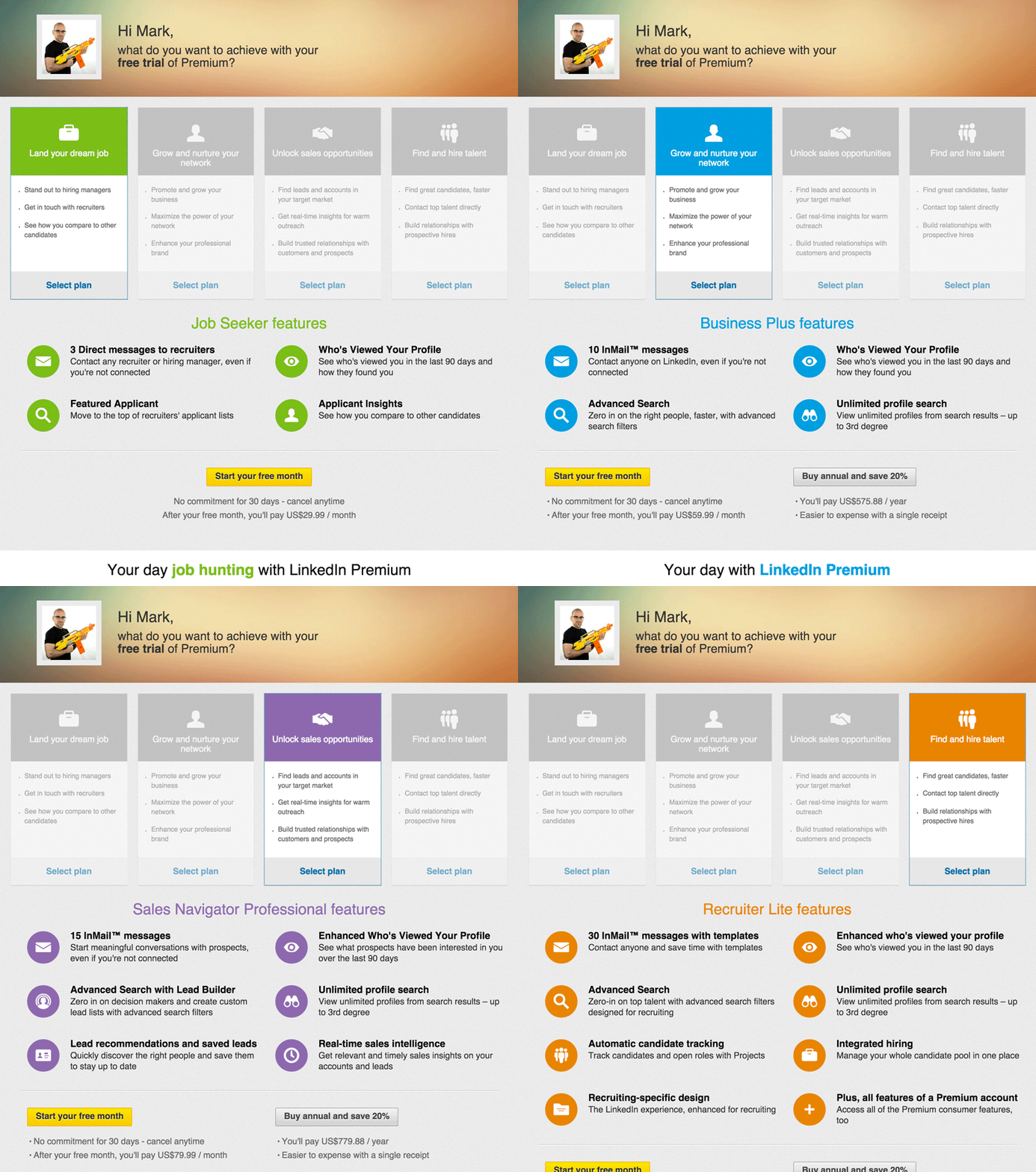
I checked the Premium purchase options on the web version. It seems the right hand and left hand don’t appear to be on the same page at LinkedIn. The pitch and approach here is COMPLETELY different.

-
There are four tiers: Job Seeker at $29.99 per month, Business Plus at $59.99 a month, Sales Navigator Professional at $79.99 per month, and Recruiter Life (which I think should be renamed to #RecruiterLife) at $119.95 per month.
-
Everything flows nicely here. The call-to-action at the top of the page “What do you want to achieve with your free trial of Premium?” compliments the display of the four different tiers below, of which each has a short answer to the aforementioned question (e.g. “Unlock sales opportunities”).
-
But the names for tiers don’t mesh well together. I can be a Job Seeker or a Sales Navigator Professional, but I can’t be a Business Plus or a Recruiter Life.
-
Also, WTF is a Sales Navigator Professional? A modern-day pirate navigating the treacherous seas of the business world?
-
Fortunately, the difference between tiers here is a little better. As you pay more, you get more features. Job Seeker and Business Plus highlight 4 features, Sales Navigator Professional highlights 6, and Recruiter Life highlights 8. It makes higher tiers look more appealing deal because you’re getting more than “more InMail.”
-
The orange for the Recruiter Life tier (#e68523) is also much better compared to the disgusting orange on the iOS version (#edb220).
-
Every tier except the lowly Job Seeker tier has an option to go annually. Not only do you save 20% by committing to an annual basis, but another benefit is that it’s “Easier to expense with a single receipt.” LinkedIn knows the struggles of the modern-day worker and is addressing those issues head-on!

What a relief!
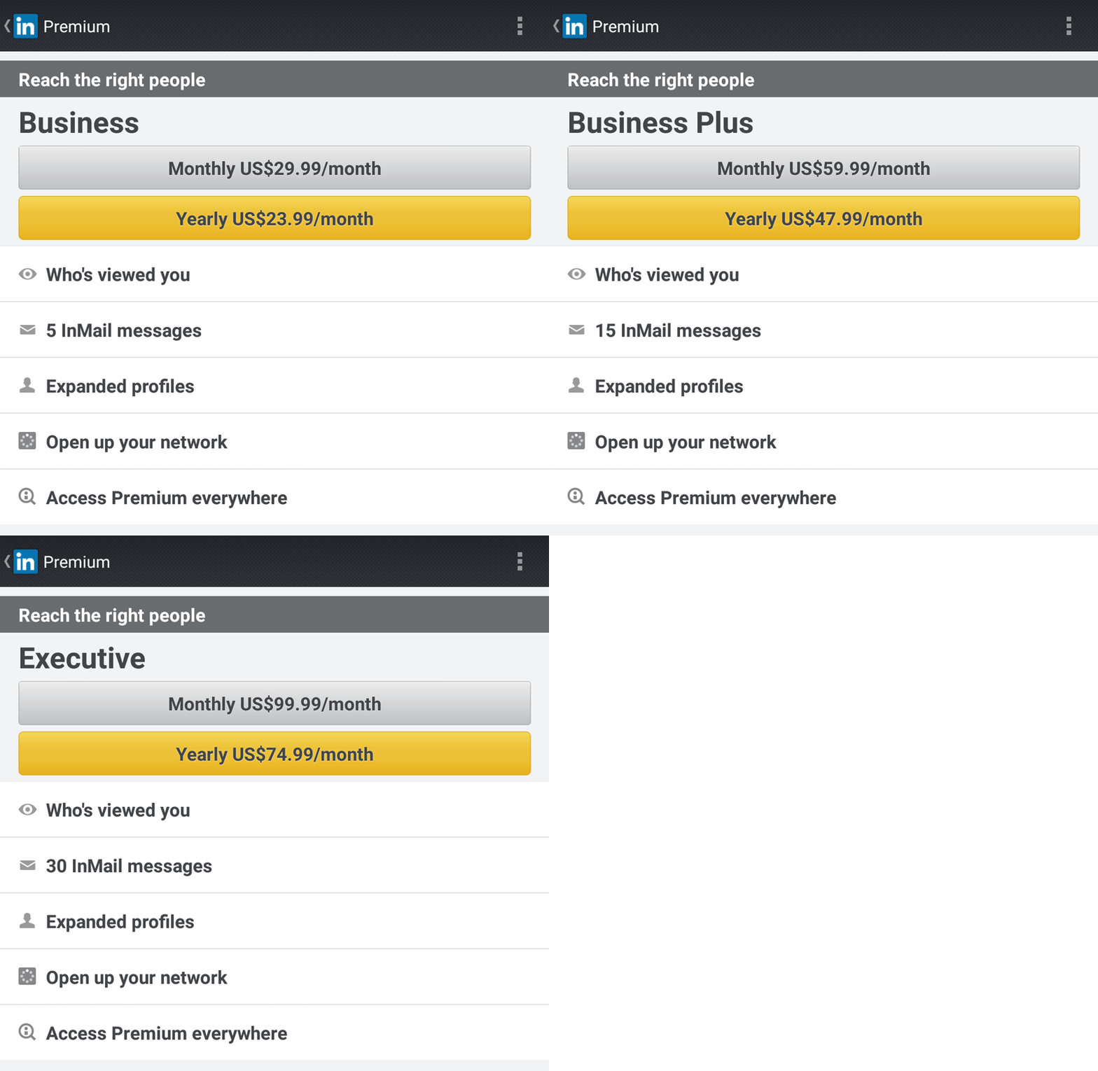
For completeness’ sake, here is what the Android version looks like.

It looks very similar to the iOS version, except it’s uglier and Android users get monthly and yearly sign-up options. Surprisingly, there is no option for a free trial. Has LinkedIn managed to successfully monetize Android users with terrible design or have they simply given up all hope for ever making money on the Android platform?