Better Safe Than Sorry UX
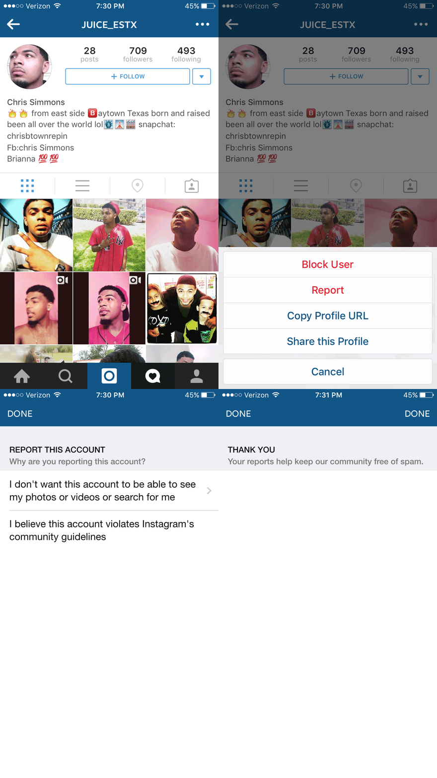
06 Sep 2015I previously wrote about the Instagram “report user” user experience, which I felt left users hanging at the end. I noticed the problematic part of the flow has recently been changed! But I’m unsure how I feel about the changes. Here’s the new “report user” flow:

DONE and DONE!
Check out that last frame where you are thanked for reporting the offending user. Before, if you reported someone Instagram made you hit “Cancel” to dismiss the confirmation but now it gives you TWO “DONE” buttons. This new UX paradigm which I dub Better Safe Than Sorry UX - let’s just put the button twice to ensure users get it is pretty innovative, certainly strange, and questionably provides a good user experience.